In the last decade, there has been a trend towards brighter retail interiors. Selfridge's in London, Printemps in Paris, Myer in Australia, The Hudson's Bay Company in Canada, and many others, have created interiors that are brighter and lighter than stores in the past. These are also in stark contrast to Nordstrom, which tends to go for more subdued, slightly old-fashioned interiors. Let's have a look...
 |
| Selfridge's Wonder Room, London |
 |
| Selfridge's Wonder Room, London |
Selfridge's in London's 'Wonder Room' on the ground floor. They've created a lovely bright, upscale interior, using their trademark yellow as an accent colour. It's executed wonderfully... it's elegant, bright, and the yellow creates a sense of place that is uniquely Selfridges. A+.
 |
| Printemps Paris Hausseman, Ground Floor Entrance to Luxury Accessory Floors |
 |
| Printemps Paris Hausseman, Atrium, Luxury Accessories |
 |
| Printemps Accessories Floor |
The flagship Printemps department store on Paris' Boulevard Hausseman has seen a spectacular renovation. It has a luxury accessories hall of three floors, being over 100,000 square feet. Canada's interior design team Yabu Pusselberg has executed the renovation in a spectacular fashion, creating one of the world's most productive and beautiful retailing spaces.
 |
| Myer, Melbourne Australia |
Melbourne, Australia-based Myer has recently completed a renovation of its flagship store. It's light, bright, and a little strange looking... but airy and pleasant nonetheless.
 |
| Third Floor, Hudson's Bay Company Toronto Queen Street |
 |
| Handbags Hall, Hudson's Bay Company Downtown Vancouver |
 |
| Second Floor, Hudson's Bay Company Vancouver |
Canada's Hudson's Bay Company department stores is also using the design team Yabu Pushelberg to renovate its Canadian stores. So far the new, brighter interiors have facilitated continually higher sales per square foot.
 |
| Neiman Marcus, Bellevue Washington |
 |
| Neiman Marcus, Bellevue Washington |
 |
| Neiman Marcus, Houston Tx. |
 |
| Neiman Marcus, Short Hills NJ |
The American retailer, Neiman Marcus, is well known for its bright, light interiors. The relatively large size of their stores and their clean, bright interiors, create an airy sense of luxury.
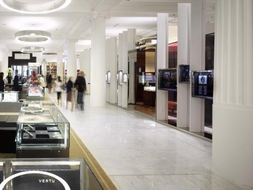
American retailer Nordstrom, as a contrast, uses a more conservative approach to their interiors. Nordstrom also tends to pack merchandise closer together than stores like Neiman Marcus. All Nordstrom photos are from Nordstrom at Westfield San Francisco Center, and are generally similar in all stores.
I personally prefer the brighter interiors. But that's just me. What do my readers think?


4 comments:
I like the brighter interiors to create a brighter atmosphere but it's less intimidating. This approach may not be for everyone, as I anticipate the major criticism would be that it's too "clinical". However, the colour accents are a nice touch to break up the white spaces. Perhaps Holts is doing the same with their signature shade? And I think although the downtown Vancouver HBC is taking the right approach to creating a more modern look, they should work on the lighting to create a more chic look.
I like the brighter interior as well. It helps the product stand more and gives an obvious sense of luxury.
I definitely agree that stores shouldn't try to look too 'clinical'. That was a criticism with The Bay's new 'White Space' departments, though they've grown on me. After strolling through Nordstrom in Seattle, The Bay's White Space looks positively glamorous.
I really liked the interior designs shown here. Great work.
Post a Comment